Analytics
Analytics shows you how members actually use your app — the Webapp they open from a link or QR, and the same app once they've installed it on their phone. It answers "how many people came, how often, on what device, and which screens they used" for a period you pick.
There's nothing to set up on this page. Traffic is measured automatically; you just read it.
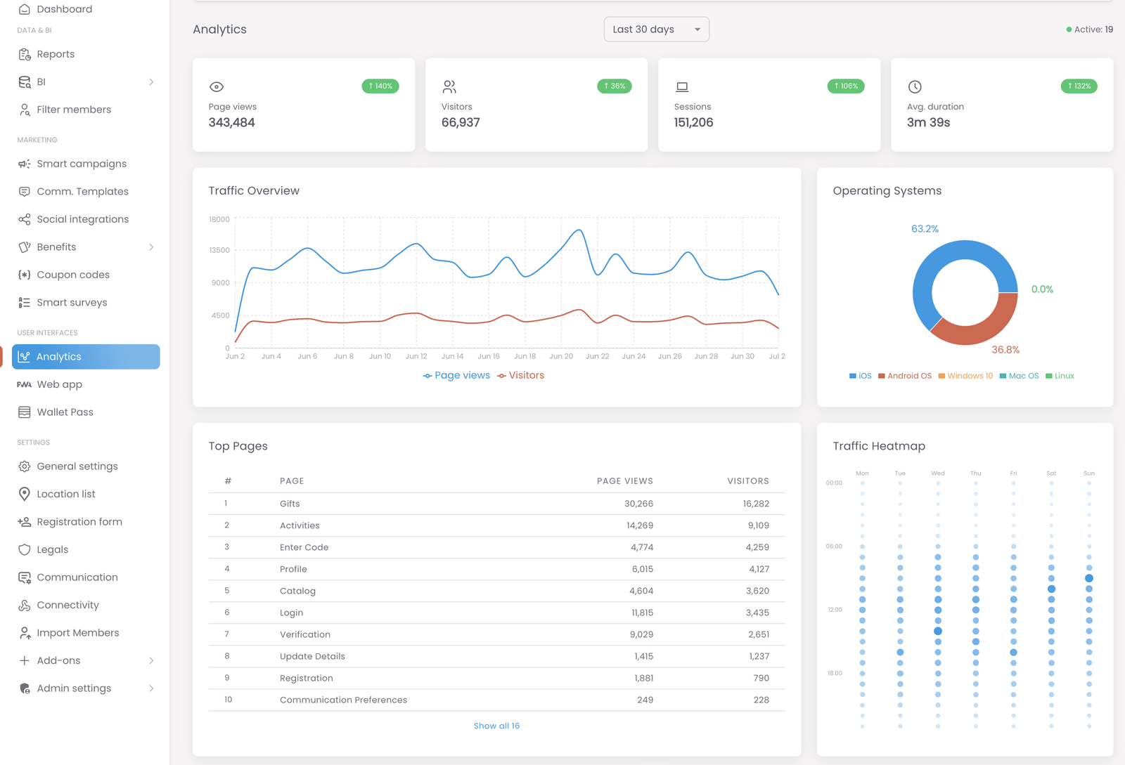
Analytics is a read-only view of your app's traffic. Pick a time range at the top right (e.g. Last 30 days) and every number, chart, and table updates to that range. Use the four cards at the top for the headline numbers, and the charts below to see trends, devices, popular screens, and when your members are active.
The date range and the live counter
Everything on the page is scoped to the time range you choose from the selector at the top right. Change the range and the whole dashboard — cards, charts, tables — recalculates for that window.
Next to it, Active shows how many members are using the app right now, in real time. It's a live pulse, independent of the selected range.
The four summary cards
Across the top you get the headline numbers for the selected range:
- Page views — total screens opened.
- Visitors — how many distinct people that was.
- Sessions — how many separate visits (one person can return several times).
- Avg. duration — how long a typical visit lasted.
Each card also shows a percentage change versus the previous period of the same length — a quick up/down signal on whether things are growing.
The charts and tables
Below the cards, four panels turn those numbers into something you can read at a glance:
- Traffic Overview — a line chart of page views against visitors over the range, so you can see peaks, dips, and the gap between "how many came" and "how much they looked at."
- Operating Systems — a breakdown of which devices members are on (iOS, Android, and so on), useful when you're deciding what to test or where your audience actually is.
- Top Pages — a ranking of the member-app screens by views and visitors, so you can see what people come for. Use Show all to see the full list beyond the top ten.
- Traffic Heatmap — activity by day of the week and hour of the day. The busier the slot, the bigger and darker the dot — handy for timing a campaign or a send when members are already around.
Watch the percentage changes and the shape of the Traffic Overview, not just the totals — a big absolute number that's trending down matters more than a small one that's climbing. And use the Heatmap to schedule sends for when members are already active, rather than guessing.